FORM
Displays a configurable form to the user (via FormBuilder). The form definition is provided in cfg.form. When submitted, the returned values are merged into the flowContext.
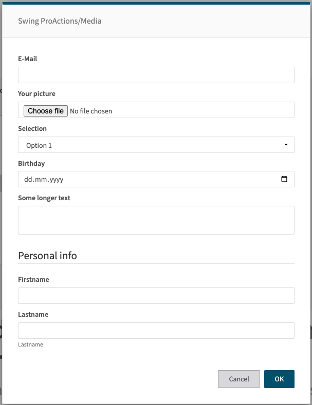
Images
At a glance
- Category UI
- Version: 1.0.2
- Applications: all
- Scope: all
When to Use
Use FORM when you need to collect structured input from users with validation and rich UI components.
Use FORM when:
- You need to collect multiple related inputs at once (name, email, options, etc.)
- You want rich input types (date pickers, dropdowns, checkboxes, text areas, diff viewers)
- You need input validation (required fields, patterns, min/max values)
- You want to show AI results for user review (diff viewer, approval checkbox)
- You need grouped or complex form layouts
Don't use FORM when:
- You only need a single simple text input - use PROMPT instead (much simpler)
- You don't need user interaction - use SET for programmatic variable assignment
- You need file selection - use FILE_UPLOAD for file picker UI
Alternatives:
- PROMPT - Simple single-line text input (use for quick, simple inputs)
- FILE_UPLOAD - File selection with upload functionality
- USER_SELECT - Selection from a list of predefined options
- SET - Direct variable assignment without user interaction
Prerequisites
Required Context:
- Form fields can reference flowContext variables for default values using {{ }} syntax
- Pre-populate fields by setting flowContext variables before FORM step
Platform Requirements:
- Works on all platforms with UI support (Swing, Prime)
- Requires modal dialog support
Data Flow
Input Sources:
- `cfg.form` - Form field definitions (type, label, default, validation, etc.)
- `cfg.title` - Modal title text
- `cfg.formConfig` - Modal configuration (size, styling, typography)
- `cfg.buttons` - Custom button configurations
- `cfg.inlineSteps` - Optional steps to run before showing form (with loading UI)
- `flowContext.*` - Variables used in field default values or diff viewers
Processing Flow:
- Executes `inlineSteps` if provided (shows loading spinner)
- Resolves templates in form field definitions
- Builds HTML form from configuration using FormBuilder
- Shows modal dialog with form to user
- Waits for user to fill out and submit form
- Validates form inputs against defined rules
- If validation passes, extracts form values
- Merges all form values directly into flowContext
Output Destinations:
- Each form field name becomes a flowContext variable
- Example: Form field "userName" → `flowContext.userName`
- Button clicks can set additional flowContext variables via `flowAttribute`
- No default text output - all values go to named flowContext properties
Config Options
| Name | Description | Default | Required | Resolved | Constraints | Conditional Rules |
|---|---|---|---|---|---|---|
title | Title of the form modal. | None | false | false | None | None |
form | Form field definitions. Each key is the field name, and the value is a FormComponent object defining the field type and properties. See the comprehensive form documentation for all available field types and properties. | None | true | false | None | None |
buttons | Optional buttons configuration for the form modal. Array of button objects defining submit/cancel buttons. | None | false | false | Items:1-10 | None |
formConfig | Optional modal-level configuration (width, height, fullScreen, typography). See FormModalConfig for all options. | None | false | true | None | None |
inlineSteps | Optional steps to execute before showing the form while an in-place loading UI is shown. | None | false | false | None | None |
form Object Structure
Form field definitions. Each key is the field name, and the value is a FormComponent object defining the field type and properties. See the comprehensive form documentation for all available field types and properties.
Dynamic Properties:
This object accepts dynamic keys. Each key-value pair should follow this structure:
- Key: Any string (field name)
- Value: One of the following types:
- External schema reference →
partial-step.form.schema.json#/definitions/formComponent - External schema reference →
partial-step.form.schema.json#/definitions/formGroup
- External schema reference →
- Description: See the referenced schemas for complete field definitions and validation rules
formConfig Object Structure
Optional modal-level configuration (width, height, fullScreen, typography). See FormModalConfig for all options.
Fixed Properties:
| Property | Type | Description | Required | Constraints |
|---|---|---|---|---|
dialogSize | string | Bootstrap dialog size: "sm", "md", "lg", "xl" | false | None |
width | string | Modal width (e.g., "720px", "80vw") | false | None |
maxWidth | string | Maximum modal width | false | None |
height | string | Modal height (e.g., "600px", "80vh") | false | None |
maxHeight | string | Maximum modal height | false | None |
fullScreen | boolean | Force modal to cover entire viewport | false | None |
bodyFontSize | string | Font size for modal body | false | None |
bodyLineHeight | string | Line height for modal body | false | None |
labelFontSize | string | Font size for form labels | false | None |
inputFontSize | string | Font size for form inputs | false | None |
inputLineHeight | string | Line height for form inputs | false | None |
diffFontSize | string | Font size for diff components | false | None |
diffLineHeight | string | Line height for diff components | false | None |
modalClass | string | Additional CSS class for modal | false | None |
buttons Array Items Structure
Each item in the buttons array should be an object with the following properties:
| Property | Type | Description | Required |
|---|---|---|---|
type | string (submit, cancel) | Button type | true |
label | string | Button label text | false |
name | string | Button name attribute (used when type is submit) | false |
title | string | Button title attribute (tooltip) | false |
class | string | CSS class for button styling (e.g., "btn btn-primary") | false |
flowAttribute | string | Flow context variable name to store the button name/value when clicked | false |
Examples
Simple text input form
- step: FORM
  title: "Your info"
  form:
    firstName:
      type: text
      label: "First name"
      required: true
    lastName:
      type: text
      label: "Last name"
      required: true
Form with various input types
- step: FORM
  title: "Content Settings"
  form:
    title:
      type: text
      label: "Article Title"
      placeholder: "Enter title..."
      required: true

    category:
      type: select
      label: "Category"
      options:
        - News
        - Sports
        - Business
      default: "News"

    priority:
      type: radio
      label: "Priority"
      options:
        - key: "high"
          value: "High Priority"
        - key: "normal"
          value: "Normal Priority"
        - key: "low"
          value: "Low Priority"
      default: "normal"

    publishNow:
      type: checkbox
      label: "Publish immediately"
      default: true

    publishDate:
      type: date
      label: "Publish Date"
      required: true

    summary:
      type: textarea
      label: "Summary"
      rows: 4
      placeholder: "Enter summary..."
Form with diff component
- step: SET
  originalText: "The quick brown fox"
  improvedText: "The swift brown fox jumps"

- step: FORM
  title: "Review Changes"
  form:
    changes:
      type: diff
      mode: "words"
      prevText: "{{ flowContext.originalText }}"
      text: "{{ flowContext.improvedText }}"
      showDeletions: true
      interactive: true
Form with formConfig sizing
- step: FORM
  title: "Large Review Form"
  formConfig:
    dialogSize: "xl"
    height: "80vh"
    diffFontSize: "14px"
    diffLineHeight: "1.6"
  form:
    reviewField:
      type: diff
      mode: "words"
      prevText: "{{ flowContext.original }}"
      text: "{{ flowContext.improved }}"
      interactive: true
Form with custom buttons
- step: FORM
  title: "Choose Action"
  form:
    action:
      type: select
      label: "Select action"
      options:
        - translate
        - summarize
        - improve
  buttons:
    - type: cancel
      label: "Cancel"
    - type: submit
      flowAttribute: "userAction"
      name: "proceed"
      label: "Proceed"
      class: "btn btn-primary"
Form with multiple action buttons
- step: FORM
  title: "Review Content"
  form:
    feedback:
      type: textarea
      label: "Your feedback"
      rows: 3
  buttons:
    - type: submit
      flowAttribute: "action"
      name: "approve"
      label: "Approve"
      class: "btn btn-success"
    - type: submit
      flowAttribute: "action"
      name: "revise"
      label: "Request Revision"
      class: "btn btn-warning"
    - type: submit
      flowAttribute: "action"
      name: "reject"
      label: "Reject"
      class: "btn btn-danger"
    - type: cancel
      label: "Cancel"

- step: SWITCH
  condition: "{{ flowContext.action }}"
  cases:
    "approve":
      - step: SHOW_NOTIFICATION
        message: "Content approved"
    "revise":
      - step: SHOW_NOTIFICATION
        message: "Revision requested"
    "reject":
      - step: SHOW_NOTIFICATION
        message: "Content rejected"
Common Patterns
AI Text Review Workflow
Show AI-generated improvements in diff viewer for user approval
# Step 1: Get original text
- step: SET
  originalText: "{{ client.getTextContent() }}"

# Step 2: Generate improved version with AI
- step: HUB_COMPLETION
  instruction: "Improve this text for clarity: {{ flowContext.originalText }}"

# Step 3: Show comparison and get approval
- step: FORM
  title: "Review AI Improvements"
  form:
    comparison:
      type: diff
      prevText: "{{ flowContext.originalText }}"
      text: "{{ flowContext.text }}"
      label: "Proposed Changes"
      interactive: true
    approved:
      type: checkbox
      label: "Apply these changes"
      default: true

# Step 4: Insert if approved
- step: IF
  condition: "{{ flowContext.approved }}"
  then:
    - step: INSERT_TEXT
      in: "{{ flowContext.comparison }}"
Multi-Field Data Collection
Collect structured data with validation
- step: FORM
  title: "Article Metadata"
  form:
    title:
      type: text
      label: "Article Title"
      placeholder: "Enter title..."
      required: true
      minLength: 10
      maxLength: 200

    category:
      type: select
      label: "Category"
      options:
        - News
        - Sports
        - Business
        - Technology
      default: "News"

    priority:
      type: radio
      label: "Priority Level"
      options:
        - key: "high"
          value: "High Priority"
        - key: "normal"
          value: "Normal"
        - key: "low"
          value: "Low Priority"
      default: "normal"

  # Use collected data
  - step: SET_METADATA
  selector: "metadata > #titlefield"
  inputs:
    - type: text
      name: title
Form with Inline Data Loading
Load data before showing form (e.g., fetch from API)
title: Example Action
  flow:
    - step: FORM
      title: "Select Template"
      # These steps run BEFORE form is shown (with loading spinner)
      inlineSteps:
        - step: REST
          url: "https://api.example.com/templates"
          method: "GET"


      # Form shows after inlineSteps complete
      form:
        text:
          type: text
          label: "My value"
          required: true

        customization:
          type: textarea
          label: "Customization Notes"
Common Pitfalls
Why: If a form field is named "text" and flowContext.text already exists, the form value will replace it, potentially losing important data
Solution: Use descriptive, unique field names that won't conflict with existing flowContext variables. Prefix form fields if needed (e.g., "form_text", "user_input").
Why: FORM has more overhead and complexity than PROMPT. For a single text input, PROMPT is simpler and faster.
Solution: Use PROMPT for single text inputs. Reserve FORM for multi-field forms or when you need specific input types (date, select, checkbox, diff).
Why: Users can close the form modal without submitting, which stop the flow execution.
Solution: Use a submit button labeled "Cancel" to handle the cancel selection.
See Also
Related Steps:
- PROMPT - Simpler alternative for single text input: Use PROMPT for single text fields, FORM for multiple fields or complex input types.
- FILE_UPLOAD - Alternative for file selection: Use FILE_UPLOAD when you need users to select/upload files, FORM for data entry.
- USER_SELECT - Alternative for simple selection: Use USER_SELECT for choosing from a list, FORM for collecting multiple inputs.
- SET - Use before to pre-populate: Use SET before FORM to set default values for form fields.
- IF - Use after to validate: Use IF after FORM to check if user submitted or cancelled, or to validate responses.
General Resources: